If you intend to self publish one of the final challenges you will face is what to do with your cover. It’s a hugely important piece of the puzzle, it’s the first impression with a potential customer and it plays a major role in their decision whether or not they pick up your book or click on it for more info. Unfortunately, being a good writer doesn’t in any way translate to being a good cover designer. There are plenty of options for those willing to pay someone else to do this work, but what if you can’t afford it or fancy having a go yourself? I fall into the latter categories, so my first question was where do I begin?
My first step was to get a better understanding of what makes for a good book cover. I stumbled upon this talk from TED, presented by the designer Chip Kidd. If you are considering making your own cover I highly recommend it as 17 minutes well spent. There’s an awful lot that goes into designing a cover and this talk touches upon several of them with interesting examples. The part that really spoke to me was making sure you use the cover to tell part of your story.
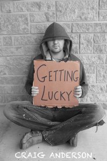
The short story I’m creating a cover for is called Getting Lucky (out soon!) and is about a homeless man and his quest to be both invisible and noticeable. He achieves this through a careful choice of clothing that make him blend in with his surroundings and witty signs that make him stand out. As I brainstormed ideas for a cover I kept coming back to this simple concept and liked how it mirrored what I was trying to achieve with my cover, to stand out from others and grab peoples attention with a clever message. I brainstormed a few other ideas but I kept coming back to this concept and found myself wondering how I could incorporate a man holding a cardboard sign into my cover design. Thankfully it’s a digital book so I only have to design the front cover.
With a high level concept in mind I now needed a willing subject for my photo shoot. The more I thought about it the more I worried about using a friend, what if my volunteer had a change of heart after all that hard work? I certainly couldn’t afford a professional model. One solution was to be on the front cover myself, but I didn’t really have the look I had envisaged, plus it’s pretty vain to put yourself on your own cover! I was racking my brains trying to come up with a solution when one occurred to me, why not put myself on the front cover but obscure my face? I tried a scarf, a baseball cap and sunglasses, but as soon as I threw on a hoodie I knew it was the most suitable option. Coupled with a tatty pair of jeans I was ready for my photoshoot.
I now had a more defined concept for my cover but I needed to explore it further. I recruited my wife as my photographer and we simply popped around the side of the house to grab a few test shots. Below is our first attempt:

My original intention was to add the words to the sign after the fact, but after playing around with it I couldn’t find a font that conveyed the style I was after. I also didn’t like the fact that the colour of the fence drew attention away from the sign. The more I looked at it the more I wondered why I was standing. We went back outside and had another stab at it:

Now that we had solved the previous issues I noticed new ones. I’d cut the sign out using scissors, and the lettering was small and neat. It just didn’t look like the signs you see a homeless person using. The change in background had helped with the contrast, but now the jeans were popping more than I wanted them to. That gave me a brainwave as to how to make sure the sign was the focus of the cover:

As soon as I made the rest of the image black and white I knew that I was on the right track. My second version of the sign was also much better, it was easier to read when shrunk to thumbnail size and looked suitably rough around the edges. I was very pleased with the results. Now all I needed to do was add my name somewhere. After a few rather conventional attempts I tried being more creative. I sketched my name as graffiti on the wall, but I quickly realised I didn’t have the artistic talent required and all the results were either pulling attention away from the title or were practically illegible. I did like the idea of the hand drawn aesthetics though, even if I couldn’t achieve them freestyle. I played around with fonts until I found a couple that met my criteria:
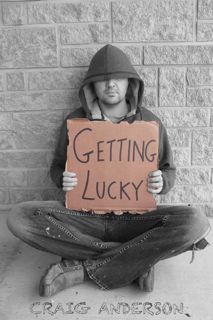

I liked them both for different reasons so I started polling friends and family. The clear favorite is the white ‘chalk effect’ version on the right, it’s cleaner and easier to read and stands out better. With my front cover finalized I am now one step closer to releasing my first short-ish story and I’ve learned a lot about cover design in the process. I hope this post helps inspire more people to have a go at making their own front cover for their stories.

Trackbacks/Pingbacks